I'll have a #19 with extra sauce
A slick game deserves pretty menus.
I've been thinking a lot about pretty menus lately, and what a game like hoop would benefit from.
Something clean, clear, not too busy, a bit more quiet and withheld than the menus - and the website - so far.
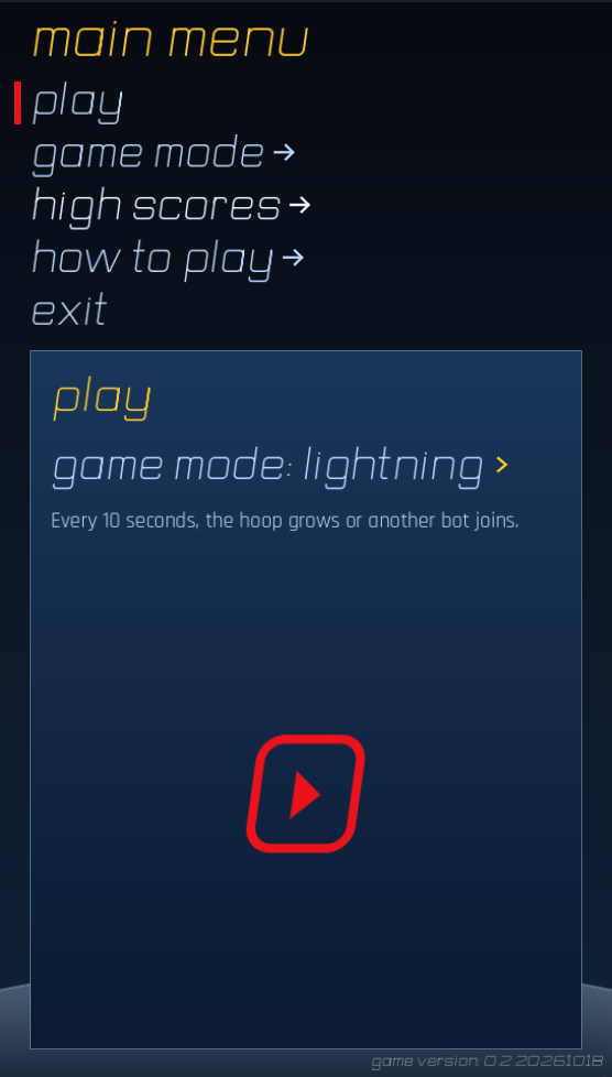
This culminated in a style guide and an approach for the menus that I feel works very well. Dark blue (almost black) to light grey tones for the background (keeping the blurred game background where possible). Yellow for headings and accents that need to catch the eye and red for interactive / action signals like selected menu items and the play button. It's sharp, crisp, fitting.
It fits hoop well because the interface is as immediate as the game: very little reading, one unmistakable action, and clear visual feedback. The logo’s Play mark provides continuity from first load through replay; the arena backdrop keeps the menus connected to the run that just ended. Everything slides, fades, moves into place. Even the play button shifts back and forth. The lightweight shapes also scale naturally to narrower screens in case we want the game to go in that direction later.
Perhaps, in time, the website should receive a similar update.